Hey there, CSS friends! This is part of a series where we’ll boost our 3D skills from beginner to advanced. Today, we’re diving into how to create a 3D space and a basic 3D object using CSS.
Watch video
The web is flat
We usually rotate something to see that it has volume. And we can do it in CSS! rotate property or rotate() function can rotate blocks in all three dimensions: x, y, z.
rotate: x 360deg;rotate: y 360deg;rotate: z 360deg;But it looks like shrinking without perspective property or perspective() function.
.parent {
  perspective: 400px;
}
.square {
  rotate: x 360deg;
}
.parent {
perspective: 400px;
}
.square {
rotate: y 360deg;
}.parent {
perspective: 400px;
}
.square {
rotate: z 360deg;
}Now, it looks like 3D, but it’s not. It’s a flat projection of a 3D transformation. And it’s ok if you need to transform only one object. But if you need to place a few objects into one 3D space — it won’t work.
.parent {
  perspective: 1000px;
}
.white-square {
  rotate: y 360deg;
}
.red-square {
  rotate: x 360deg;
}
We can fix it using a transform-style property. It says all the direct children of the block should live in one 3D space. **It’s not inheritable, so you need to apply this property to every parent element. Usually, I apply it to all the elements within my 3D scene.
.parent, .parent * {
  transform-style: preserve-3d;
}
.white-square {
  rotate: y 360deg;
}
.red-square {
  rotate: x 360deg;
}
Perspective
We can use the perspective property to change the distance between the user and the (0, 0, 0) point of your 3D scene.
You can experiment with this number to find the best perspective for your scene. For most scenes, I prefer the default one.
Since it’s a distance between the user and the (0, 0, 0) point of your 3D scene, the position of this point makes a big difference for the final picture.
.parent {
  transform-style: preserve-3d;
  perspective: 1000px;
  perspective-origin: center center;
}
Basic 3D object
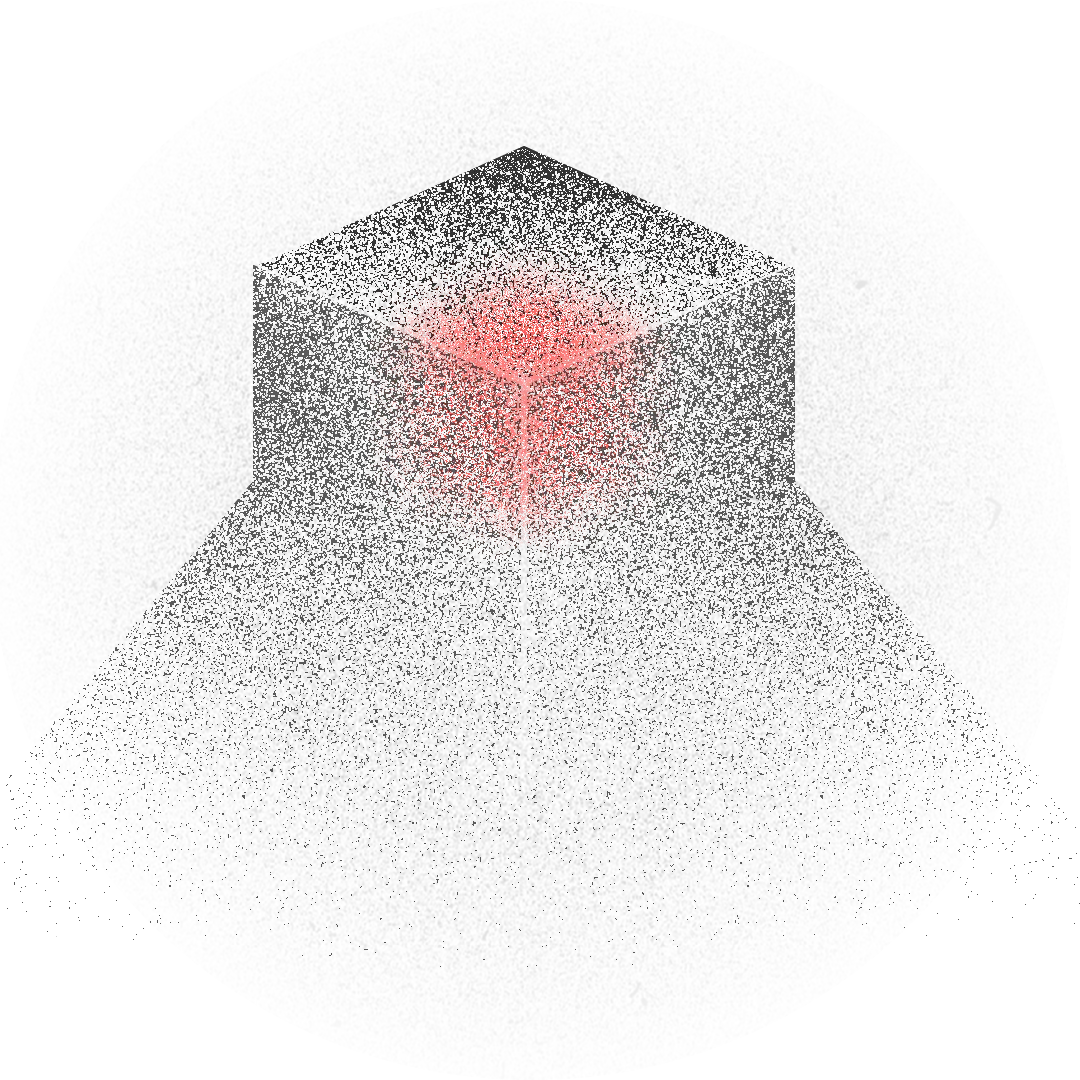
It’s time for our first 3D object! Every 3D editor starts from a sphere, cube, or pyramid as a basic shape. However, since CSS is not a 3D tool, we have no 3D objects at all. We need to create them from scratch. And the easiest one is a cube.
The cube object consists of six faces. One div can create three faces: the element itself and two of its pseudo-elements. And we need one more div with its pseudo-elements.
I keep the root element unchanged and place all the elements on top.
We need to define their anchor points to place all the elements in the right places. The anchor point controls the direction of the animation. In CSS, it is defined with the transform-origin property. You can use any units you want and place this point anywhere within or outside the block. You can even change the z-axis!
transform-origin: 10% 30%;transform-origin: 50% -20pxNow, let’s define anchor points for all the cube faces and rotate them!
.cube {
  transform-origin: center center;
}
.cube::before {
transform-origin: top center;
rotate: x 90deg;
}.cube::after {
transform-origin: center left;
rotate: y -90deg;
}.cube div {
transform-origin: center right;
rotate: y 90deg;
}.cube div::before {
transform-origin: bottom center;
rotate: x 90deg;
}.cube div::after {
transform-origin: left center;
rotate: y 90deg;
}Make it prettier ✨
Let’s make our cube prettier! To change the shades of the faces, we can use the color-mix function. I’ll mix the colors with the background color.
.cube {
  --top-color:    color-mix(in srgb, var(--color) 100%, var(--background));
  --front-color:  color-mix(in srgb, var(--color) 90%, var(--background));
  --bottom-color: color-mix(in srgb, var(--color) 20%, var(--background));
  --back-color:   color-mix(in srgb, var(--color) 60%, var(--background));
  --side-color:   color-mix(in srgb, var(--color) 80%, var(--background));
  background: var(--bottom-color);
}
.cube::before     { background: var(--side-color); }
.cube::after      { background: var(--back-color); }
.cube div         { background: var(--side-color); }
.cube div::before { background: var(--top-color); }
.cube div::after  { background: var(--front-color); }
Make it smarter 🧠
Now, we can make this cube a little bit more universal. Let’s create three properties: x, y, and z, which are the cube’s width, height, and depth, and then apply them to our cube’s faces.
Now you can change these numbers and see what happens ✨
.cube             { width: var(--x); height: var(--y); }
.cube::before     { width: var(--z); height: var(--y); }
.cube::after      { width: var(--x); height: var(--z); }
.cube div         { width: var(--z); height: var(--y); }
.cube div::before { width: var(--x); height: var(--y); }
.cube div::after  { width: var(--z); height: var(--x); }
Make it more creative 🐔
Having a universal cube is a great power. Now we can create anything! Do you know the Minecraft game? With the cubes, you can make a world.
But let’s start with an animal. I’ll take a chicken, but you can create any animal you want. I copy-paste the cubes N times and call them semantically. Then, I color them with the right colors and change dimensions.
Then, I place these cubes properly to get the final chicken.
See the Pen Chicken. Complete 3D CSS Guide Part 1 by Julia Miocene (@miocene) on CodePen.
Today, we learned how to create a 3D space, a basic 3D object, and a cubic animal. Share your animals on your favorite social media and tag me @julia_miocene.
Don’t forget to keep the web weird.