

Hey there, CSS friends! This is the second part of a 3D series. The first one is here, start from there.
Last time we created a universal cube and a chicken. But today we’ll try to make it and some other objects real. We’ll learn what is a light source, why we need it and how to work with it.
Watch video
In real life, we have the sun, a lamp, or anything else that produces light. In CSS… well, we don’t have actual light sources. But we can fake it — and we can make it look real. Highlights, shadows, warmth, reflections — all from code. Let’s break down how real light behaves, and then I’ll show you how to mimic that in CSS.
Light Source Characteristics
A light source has a few key traits: distance, direction, size, warmth, intensity, and quantity. I’ll show examples as we go.
Distance
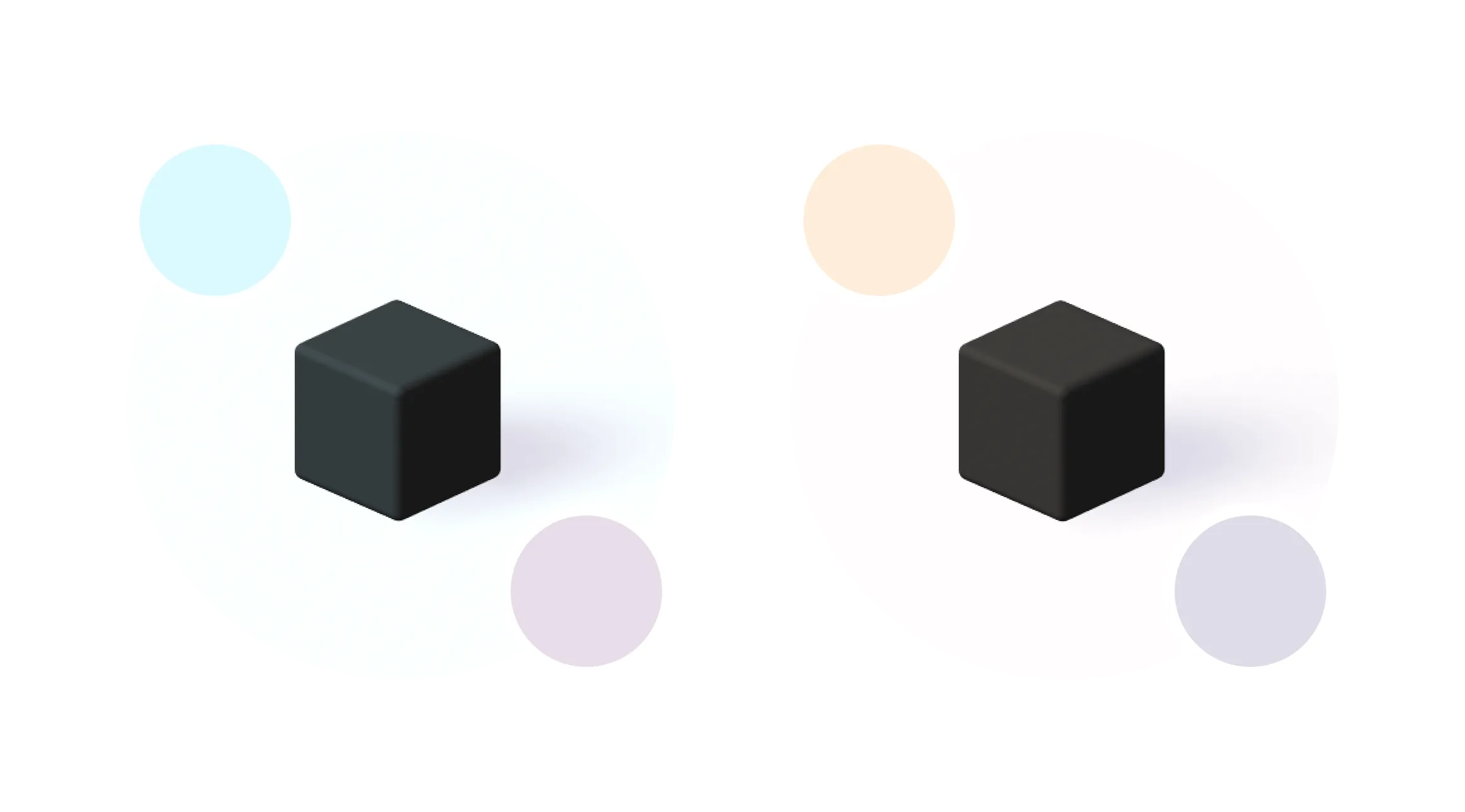
Distance is how far the light is from the object. It could be right above, way off to the side — or very far away.
The closer the light source, the brighter the object appears. As the distance increases, the light fades — so we’ll need to factor that in when simulating it.
Direction
To get a sense of direction, imagine a regular desk lamp. It shines light in one direction. Now picture a tube light — it throws light out more evenly, in multiple directions.
The shape of the light source matters too. A flat light creates a shadow similar to the object’s shape. A directional or narrow light distorts that shadow more.
So when you place a virtual light in your CSS scene, its direction will change how your shadows look and where your highlights land.
Size
Lighting a room with a candle? Not gonna work. You’ll only light a tiny part.
Same in 3D: the smaller the light source, the smaller the area it affects. A large, diffuse light spreads more softly and affects a wider range of surfaces.
Intensity
Intensity is all about contrast. Higher intensity means stronger contrast between lit and shadowed areas. It also means sharper, more defined shadows. Lower intensity softens everything — lights, transitions, and shadows.
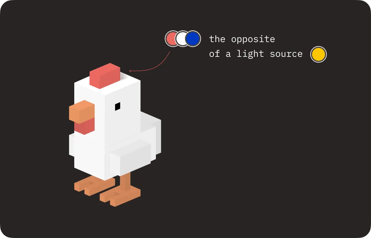
Warmth
Light has temperature — warm or cool. The warmth of your light source affects color. A warm light (like a candle or the sun at sunset) casts yellow-orange highlights and cool blue-ish shadows. A cool light (like some LEDs) does the opposite — bluish highlights and warmer, brown-ish shadows.
Quantity
Can you have multiple light sources? Absolutely. Should you? Maybe.
Multiple lights can make a scene look more real or dramatic, but they also make it more complex — especially in CSS. If you’ve got time and patience, go for it. If not, stick with one and master it first.
Creating a Light Source in CSS
Here’s how I approach it in CSS. When I start working on lighting in CSS, I usually sketch it out. I draw the light source, draw rays from it to my object, and use that to decide where the highlights and shadows go.
I place the light wherever I need in the scene, then imagine how the light rays would interact with the object’s surfaces.
Color Logic
To keep things manageable, I define a custom property for the main object color. If I’m working with a complex object, I might define a few.
—red:  #FF5E5B;
—white:  #FFFFFF;
—orange:  #ff945b;
Then I look for the surface closest to the light. That surface gets the purest form of the light color — but not directly. I use the color-mix() function to blend the light color with a shadow color.
background-color: color-mix(in srgb, var(—color), var(—light) 0%);I also define the shadow color as another custom property. For now, let’s say it’s black — we can tweak that later.
Surfaces slightly further away get a slightly darker tint — still using color-mix(), just with different ratios. The more distant the surface, the more of the shadow color it takes on.
/* COLORING */
  .chicken__head > div,
  .chicken__comb > div,
  .chicken__comb::after,
  .chicken__beak > div {
    background-color:  color-mix(in srgb, var(--color), var(--shadow) 0%);
  }
  .chicken__head::after,
  .chicken__body::after,
  .chicken__beak::after {
    background-color:  color-mix(in srgb, var(--color), var(--shadow) 3%);
  }
  .chicken__wing::after {
    background-color:  color-mix(in srgb, var(--color), var(--shadow) 5%);
  }
  .chicken__head > div::before,
  .chicken__head > div::after,
  .chicken__body > div::before,
  .chicken__body > div::after,
  .chicken__comb > div::before,
  .chicken__comb > div::after,
  .chicken__beak > div::before,
  .chicken__beak > div::after,
  .chicken__finger::after {
    background-color:  color-mix(in srgb, var(--color), var(--shadow) 7%);
  }
  .chicken__wing > div,
  .chicken__wattle > div::before,
  .chicken__wattle > div::after {
    background-color:  color-mix(in srgb, var(--color), var(--shadow) 9%);
  }
  .chicken__body > div,
  .chicken__tail > div,
  .chicken__wing > div::after,
  .chicken__wattle::after,
  .chicken__finger > div,
  .chicken__foot > div {
    background-color:  color-mix(in srgb, var(--color), var(--shadow) 12%);
  }
  .chicken__finger > div::before,
  .chicken__finger > div::after,
  .chicken__foot > div::before,
  .chicken__foot > div::after,
  .chicken__knee::after,
  .chicken__tail > div::before,
  .chicken__tail > div::after,
  .chicken__head::before {
    background-color:  color-mix(in srgb, var(--color), var(--shadow) 15%);
  }
  .chicken__knee > div::before,
  .chicken__knee > div::after,
  .chicken__wing::before,
  .chicken__beak {
    background-color:  color-mix(in srgb, var(--color), var(--shadow) 18%);
  }
  .chicken__foot::after,
  .chicken__wattle,
  .chicken__knee::before,
  .chicken__body::before {
    background-color:  color-mix(in srgb, var(--color), var(--shadow) 20%);
  }
  .chicken__foot::before,
  .chicken__wing,
  .chicken__tail::before {
    background-color:  color-mix(in srgb, var(--color), var(--shadow) 22%);
  }
  .chicken__body,
  .chicken__tail {
    background-color:  color-mix(in srgb, var(--color), var(--shadow) 28%);
  }
If your light source is super intense, push the contrast: your highlights will be brighter, and the backside of the object might be nearly black.
If your light is soft and diffused, surfaces will blend more evenly.
Shadow Color
Shadow color depends on the warmth of the light source. In practice, your shadow color is a mix of the object’s base color, the light source’s warmth, and the angle of the surface.
For my object I got #c07d9e color. Now, I need to make it darker, mixing it with black color.
—shadow: color-mix(in srgb, #c07d9e, #000000 50%);Casting Shadows in CSS
Here’s how I handle shadows: I draw imaginary light rays from the source to the edges of the object. Then I outline the shape using the clip-path property.
Usually, I apply this shape to a ::before pseudo-element and blur it using the filter on the parent.
.shadow {
  clip-path: polygon (...);
  filter: blur();
}.shadow {
filter: blur();
}
.shadow::before {
clip-path: polygon(...);
}The amount of blur depends on: size, intensity and direction of the light. Smaller, more intense, directional lights cast crisp shadows. Big soft lights? Blurry shadows.
Shadows On the Object
This is different from the cast shadow. Here’s how I do it:
- For simple shapes — gradients.
- For complex shapes — the
::afterpseudo-element. That lets me layer the object’s color separately from its shadows.
See the Pen Chicken. Complete 3D CSS Guide Part 2 by Julia Miocene (@miocene) on CodePen.
Some other examples
This knowledge is useful for objects with any complexity: a cube in a clean environment, a cubic character, a polygonal cat, an eye, or the hands of God and Adam from The Creation of Adam.
See the Pen Pure CSS 3D Cat by Julia Miocene (@miocene) on CodePen.
See the Pen Pure CSS 3D David Eye by Julia Miocene (@miocene) on CodePen.
See the Pen Pure CSS 3D Creation of Adam by Julia Miocene (@miocene) on CodePen.
Now you know how to create a cubic character and use a light source. Next time, we’ll learn how to create more complex characters, animate them, sculpt, do origami and more!
Today, we learned what a light source is, why we need it, and how to work with it. Share your demos on your favorite social media and tag me @julia_miocene.
Don’t forget to keep the web weird.